Wordmark
Okami's name as it's signed: the glass logo in colour, then okami, semibold and tight. The landing's nav and the app's sidebar both wear it.
Example
okami
import { Wordmark } from "@/components/shared/wordmark";

<Wordmark />
Sizes
okamiokami
import { Wordmark } from "@/components/shared/wordmark";

<Wordmark size="sm" /> {/* the app's sidebar */}
<Wordmark /> {/* the landing's nav */}
Lively
okami
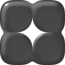
import { Wordmark } from "@/components/shared/wordmark";

<Wordmark palette="black" lively /> {/* the landing's nav */}
API reference
| Prop | Type | Default | Description |
|---|---|---|---|
| size | "sm" | "md" | "md" | The logo: md 32px (the landing's nav), sm 24px (the app's header). The name is set the same. |
| nameFrom | "lg" | — | The name only from 1024px: on a phone the glass logo signs alone, as in the app's header. |
| palette | "color" | "black" | "color" | color: the studio's mix (the app). black: Okami's own black glass, where Okami speaks for itself (the landing, legal pages). |
| lively | boolean | false | Under a hovering pointer the logo turns to thinking, loading or the face, at random and never the same twice running, and back to the star on leave. Its canvas spills past the logo's box (DotMark frame="spill"). |
| className | string | — | Placement only; the size and type are the mark's. |
Guidelines
- Lowercase okami, always. The logo comes first, framed tight so it sits flush with the edge it starts from.
- Lively only where Okami greets a visitor — the landing's nav. A touch never sets it off: a tap is the way home, not a hover. In the app the mark holds still.
- It isn't a link. Wrap it in one where it leads home, with the focus ring on the link.